THE CHALLENGE
With lean resources and a tight deadline, my team was tasked with defining an MVP and launching the City of San Jose’s new website (delayed by over 2 years). We collaborated with a cross-functional team comprised of IT, Communications, City departments, and an external software development vendor.
WHAT WE DID
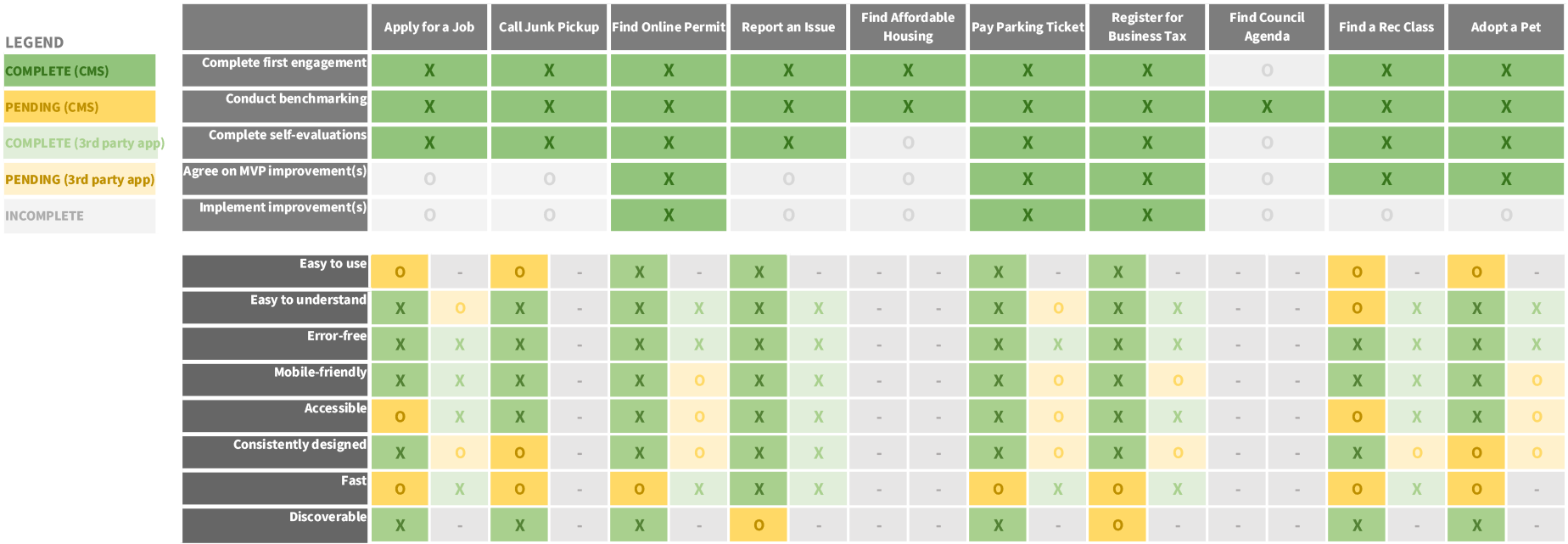
Piloted a framework for evaluating the top tasks - 8 Point Usability Standard - with clearly defined “Definitions of Done”.
Designed a curriculum that built stakeholder alignment and momentum for the project.
RESULTS
On track to successfully meet our usability standards for at least 9 of the 10 top tasks.
“Adopt a pet” top task case study
We have been struggling to meet the “Easy to Use” usability standard with less than 3 out of 4 mobile and 3 out of 4 desktop users able to complete the following task through unmoderated remote usability testing:
“Imagine you found a dog you want to adopt on the City website. Figure out the next step required to adopt the dog. Please don’t spend longer than 5 minutes on this task.”
Original “Adopt a Pet” landing page
Take 2: The landing page is “Consistently designed” and “Discoverable” but still not “Easy to Use”
2 out of 4 mobile users are unable to complete the task.
Take 3: We will test this again next week
The San Jose City website receives over 2 million visitors a year as the City’s digital front door. Using evidence-based user research, we redesigned its front page to be more useful and faster loading.
Users revealed in a survey that they were frustrated by that the images and writing didn’t match in the dynamic carousel. The front page took almost 16 seconds on mobile; we are aiming for 5 seconds. Also, the carousel was so large that it pushed useful “Top Requested” buttons beneath the “fold.”
We mocked up several alternatives and tested them against the existing design through an online remote preference test. 25 people responded. We used the results to influence the Communications team (owner of the website).
Option 1 (the winner)
45% preferred - Internal search
“City pages [have] many functions. I believe it's best to optimize the search functionality and use the search bar as the main tool…” - One respondent
“Because it gives me the option to enter my exact query.” - One respondent
Option 2 (implemented)
41% preferred - Reduced image
“Less space wasted with a photo, straight to the content.” - One respondent
Option 3
9% preferred - Static image, same size as original
Option 4 (original)
5% preferred - Rotating carousel image


